Context
By 2021, specialty coffee in Ukraine mostly still meant a counter and a bag — a local roaster selling in person, one transaction at a time. Selling beans online and building repeat purchase through subscription rather than one-off orders was a genuine shift in how the business operated, not just a new coat of paint on an existing shop. That meant the identity had to do more than look good on a bag: it had to hold up as a black-and-white mark on packaging, on a physical café sign, and inside a product interface — the same brand recognizable across three completely different surfaces a customer might meet first.
The problem
A local roaster needed to sell beyond the café counter — beans online, and retention through subscription rather than one-off orders. The original brief for the app is direct about the goal: make coffee closer to people, let them buy a subscription and save money against one-off pricing, with the option to still order from the nearest physical café rather than only ship beans.
That's three different customer relationships living in one product: someone who wants beans delivered on a schedule, someone who wants to order ahead from a specific café, and someone browsing a catalogue by origin and roast. The identity had to read the same way across all three, and across a completely different set of physical constraints too — a mark has to survive a 250g bag at arm's length, a storefront sign read from across a street, and a product card at thumbnail size, without becoming three different logos in practice.
Constraints
The studio's records don't carry a budget or timeline figure for the 2021 engagement, so none is stated here. What is a real, documented constraint is the range of surfaces one mark had to survive without a redesign: packaging at various sizes down to a 250g retail bag, a physical café sign, and a digital product interface with its own states — catalogue, product card, checkout. A logo that only has to work on a business card doesn't have this problem; one built to run a subscription business does.
The solution
The wordmark is neo-brutalist by design: a heavy grotesque typeface, a mirrored Ǝ standing in for the E, and a strict black-and-white base with no gradients — a deliberate departure from the pastel, illustration-heavy register a lot of specialty coffee branding leans on. The restraint isn't decorative; it's what makes the mark hold up identically whether it's printed on a kraft bag, cut into a lightbox sign, or rendered at 32 pixels in a mobile nav bar. Color and gradient reproduce differently across print, signage and screen; a fixed black-and-white mark doesn't have that problem in the first place.
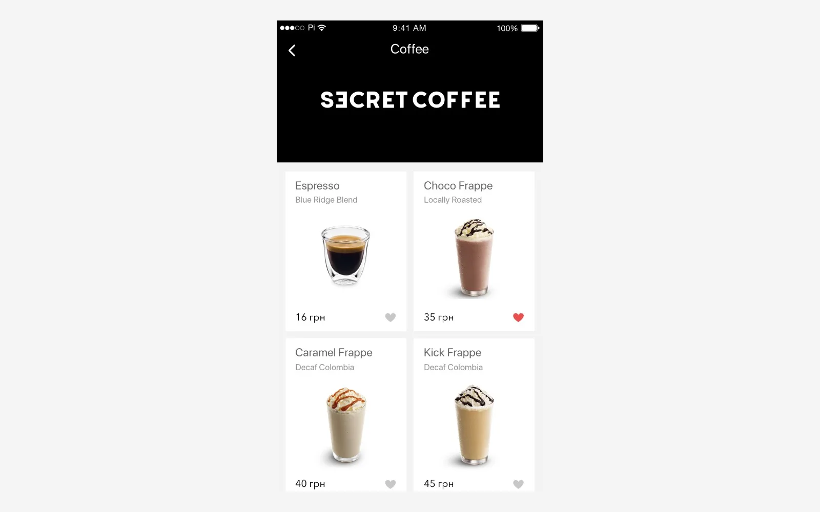
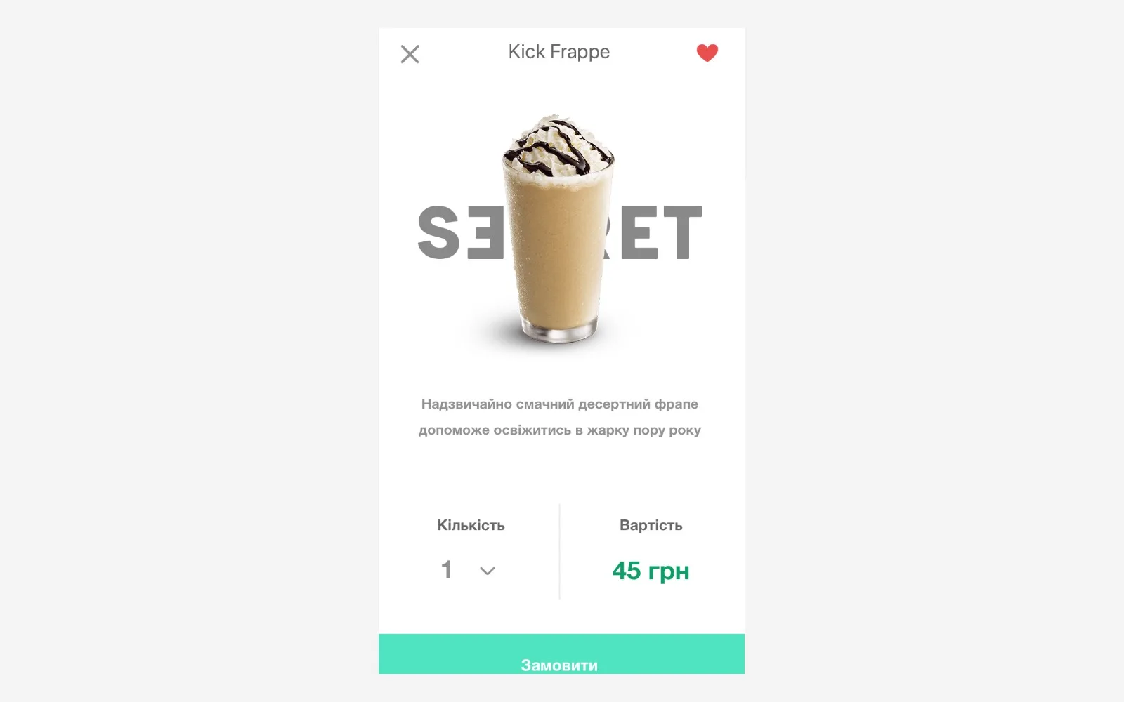
On the product side, the app was designed around three real flows rather than one generic storefront: a drink catalogue for browsing, a product card built to carry a recipe alongside the item (not just a photo and a price), a volume selector for subscription sizing, and the option to order from the nearest physical café instead of only shipping beans. That last flow is the one detail that reveals this wasn't a generic e-commerce template — it's built around a business that still has a physical counter and doesn't want the app to compete with it.
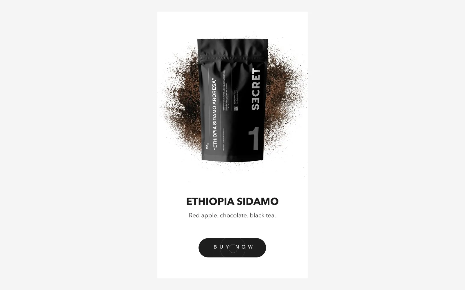
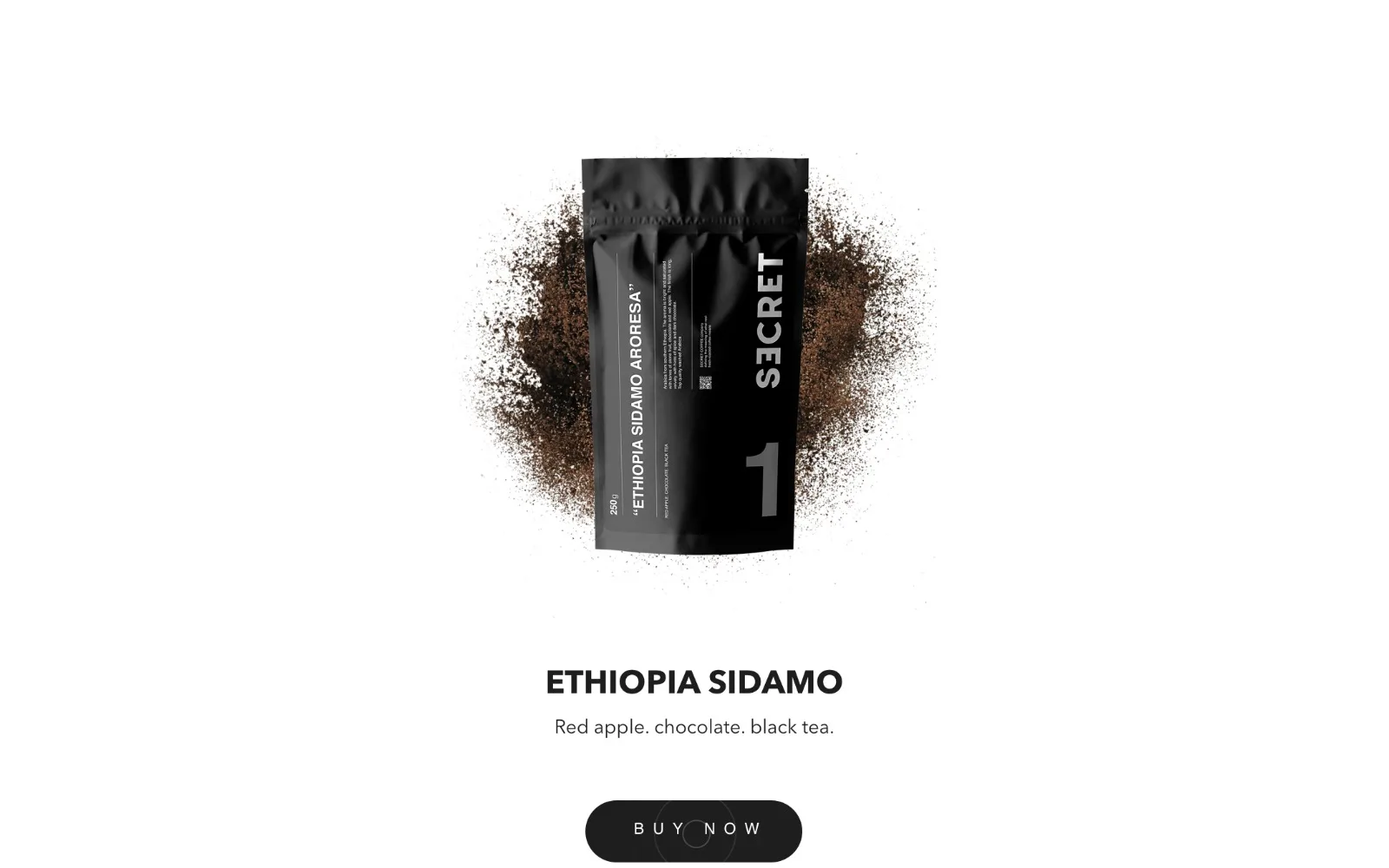
The identity then carried into the online store's catalogue structure: beans organized by single origin (Brazil, Ethiopia, Nicaragua), drip packs for people who don't want to think about brewing, decaf, and blends — the same black-and-white system applied to a real product taxonomy, not just a homepage banner. The store live today still runs that same structure: Popular, Espresso Roast, Drip and Blends as the standing categories, individual products, and — notably for a specialty roaster — two physical retail locations in Ivano-Frankivsk alongside the online store, meaning the identity still has to do the sign-plus-bag-plus-screen job it was designed for, not just the screen part.
What we rejected
We don't have a preserved shortlist of alternate directions for this project, so we're not reconstructing one. What's verifiable from the mark itself is the register it didn't choose: specialty coffee branding in this period leaned heavily toward soft illustration and pastel palettes, signaling craft through warmth. Secret Coffee's wordmark goes the other way — heavy, geometric, black-and-white, closer to a hardware or streetwear mark than a café one. That's a legible choice against the category default, not an accident of restraint.
How it survived production
Most brand-book case studies claim longevity in the abstract — "the client still uses it." This one is checkable: the store is live at secret-coffee.store today, selling the same product taxonomy the identity was built around — Popular, Espresso Roast, Drip and Blends — at real listed prices, from two physical locations in Ivano-Frankivsk rather than an app-only storefront. That's the mark surviving contact with actual retail operations for multiple years, not a screenshot from the handoff meeting.
What we can't confirm from here is whether the subscription flow from the original brief is still the primary purchase path today, or whether the business has shifted more toward direct catalogue sales since — the storefront we could check doesn't settle that either way, so we're not asserting it.
Outcome
What we can stand behind, checkable by anyone: the identity launched in 2021 and the business it belongs to is still trading under it today, unchanged, across a bag, a storefront sign and a screen. That's the argument for treating a brand book as infrastructure rather than a one-time deliverable — the real test isn't the handoff, it's whether the mark is still doing its job years later without us in the room.
Scope