Soloway
A 30-page brand book and a 17-item merch system, built to survive without its author.
Context
By 2021, the studio had already run one full identity-to-product chain with Ridex. Soloway was a different kind of problem: not a brand that had to explain an unfamiliar category to strangers on the street, but one that had to survive being handed to strangers inside the company's own supply chain — printers, merch vendors, whoever placed the next order for branded socks or a tote bag. The brief wasn't really about the logo. It was about what happens after the brand book ships: does the fifth vendor who's never spoken to the studio produce something that still looks like the same company as the first.
The problem
The company needed an identity it could hand to a vendor and get a predictable result — without a "what's the clear space here?" call on every order. That's a different design problem than a single hero application like a logo on a building.
A brand system meant for merchandise has to answer questions a poster designer never has to: what does the mark look like white-on-navy on a yoga mat versus foil-stamped on a leather notebook cover versus screen-printed on a sock, where the printable area is a few centimeters wide? Leave the rules vague, and every vendor interprets clear space and minimum size differently — the badge ends up crisp, the sticker ends up muddy, and within a year the same logo exists in five slightly different versions across the office. The studio had to write a system precise enough to survive a vendor it would never personally oversee — whoever picked up the seventeenth order down the line.
Constraints
Soloway wasn't a from-scratch launch on the scale of Ridex — it's a corporate identity brief, and the studio's records don't carry a budget or timeline figure for the 2021 engagement, so none is stated here. What the brand book itself documents as a real constraint is breadth: 17 separate merchandise applications, each with its own material, print method and minimum-size problem, specified inside a single 30-page system — roughly one detailed application section for every notebook-page-and-a-half, a materially different scope than a brand book built around one or two flagship touchpoints.
The solution
The identity starts from three stated values — balance, simplicity, partnership — and the mark is built to carry all three literally, not just as a mood-board reference. It combines a perfect circle, echoing the "O" in the name, with two leaf shapes forming its base; read as a whole, the guidelines describe it as a sun rising over the horizon, and the motion version of the logo animates exactly that — the circle rising up from behind the leaves. The brand book's own framing also reads it as the letter S taking shape from those same elements — one mark doing triple duty as initial, symbol and motion cue.
Color runs a signature gradient alongside two fixed brand colors: a pink (D32265) and a dark navy (07163F). Typography splits the same way Ridex's did: Days One as the display face carrying the wordmark's character, Avenir Next as the secondary face for internal documentation. For the inverted, light-background version of the logo, the rule is narrow and specific — the graphic stays exactly as-is, only the wordmark's color shifts from white to the brand navy — precise enough that two designers working from the same page produce the same result.
The system extends into a background pattern: the logo itself, enlarged and dropped to reduced opacity, rather than a separate decorative graphic invented for the purpose — one visual idea reused instead of a second one added.
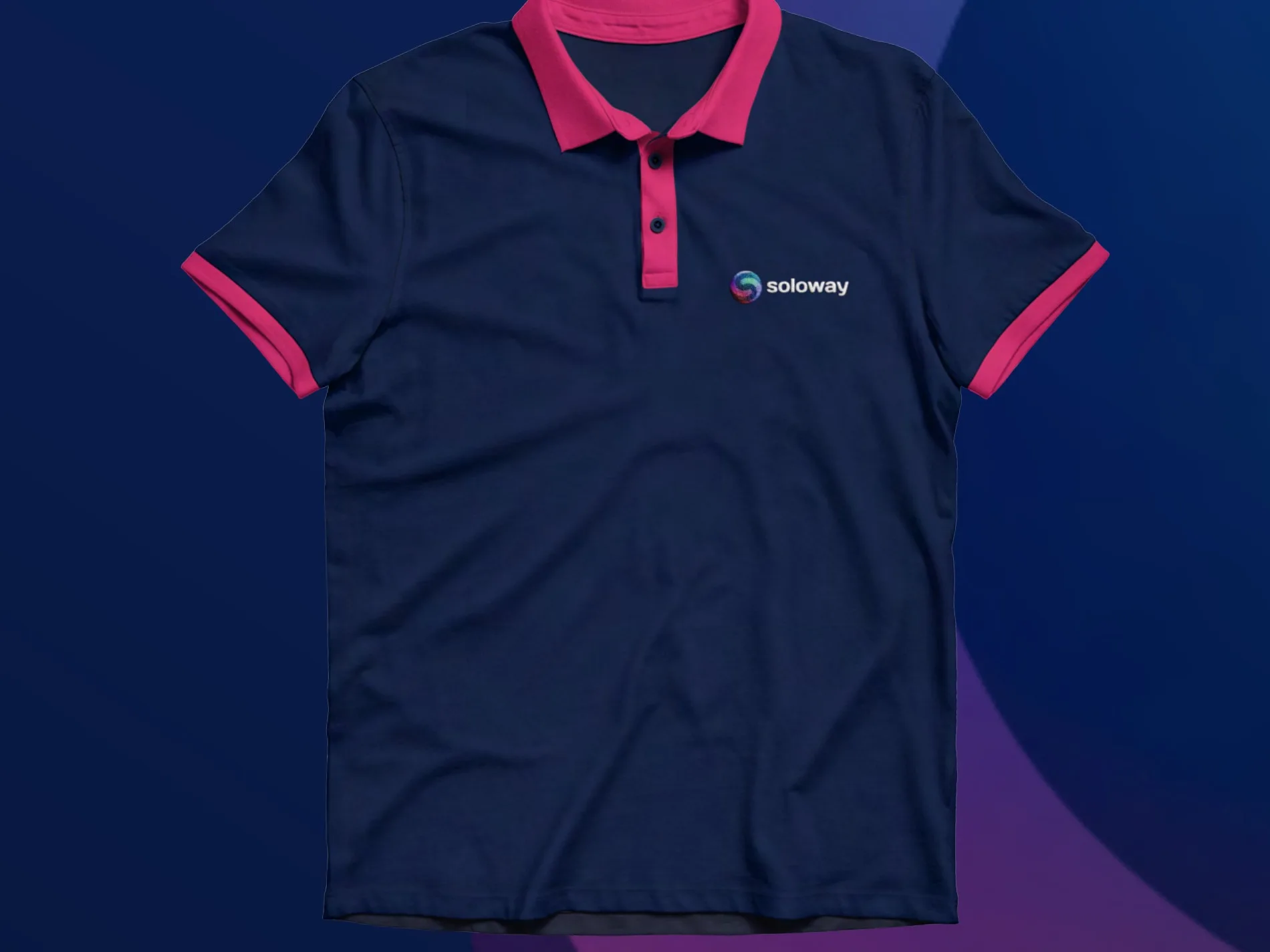
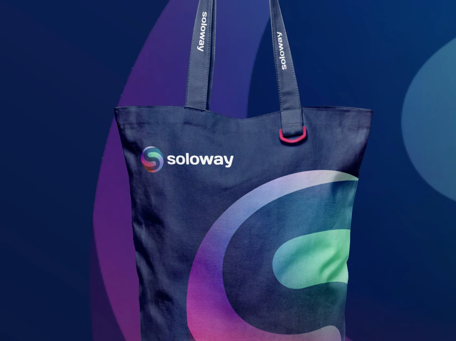
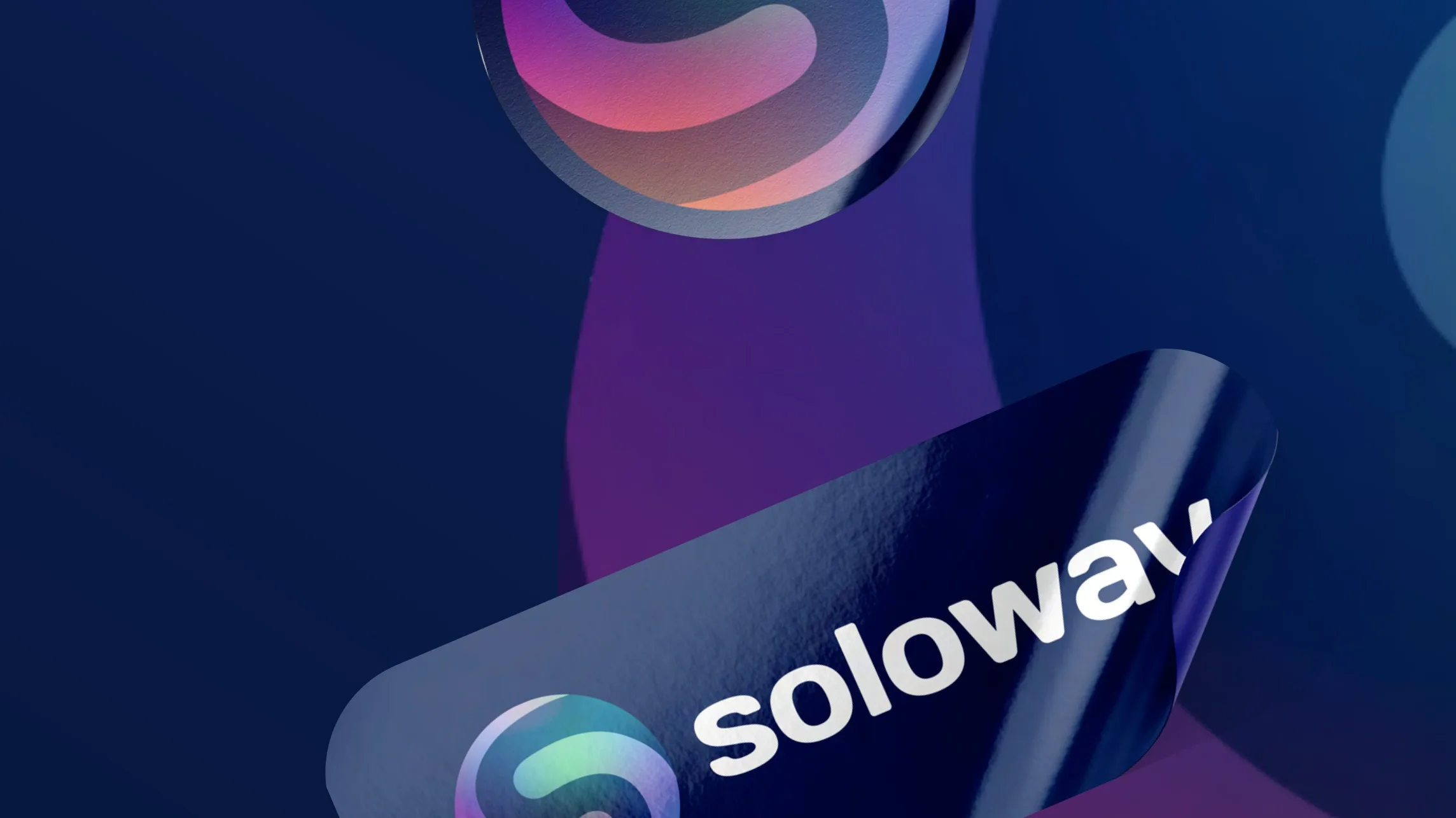
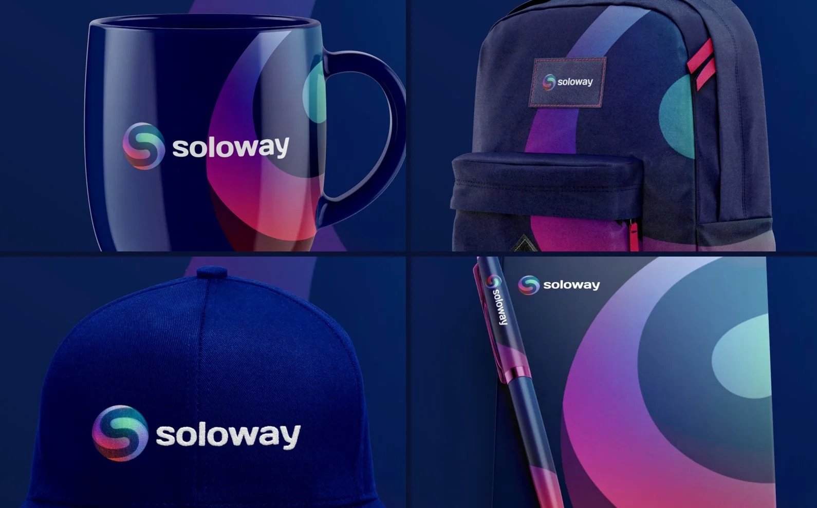
Then the guidelines cover 17 physical applications, each specified on its own page: notebook and pen, a standalone notebook, a mug, a t-shirt, a polo, socks, glasses, a yoga mat, a backpack, a tote bag, a badge, a bottle, stickers, a phone case, letterhead, business cards, a cap. That's not a merch catalogue bolted onto a logo — it's 17 separate answers to "how does this mark behave on this material, printed by this method, at this size," each one removing a decision a print vendor would otherwise have to guess at.
What we rejected
We don't have a preserved record of alternate logo directions for this project either, so — same as with Ridex — we're not going to invent one. What the guidelines do show is a choice made in favor of restraint: the mark could have leaned on the gradient as its primary identity element, the way a lot of 2021-era brand marks did. Instead the gradient is a secondary device, and the fixed two-color pink/navy pairing carries the system in every application where a gradient would be harder to reproduce reliably — screen printing on a sock, foil on a notebook, embroidery on a cap.
How it survived production
The real test of a system like this isn't the logo page, it's page 17 of 30 — the point where the same rules have to keep working through a notebook, a mug, a yoga mat and a phone case without a designer re-deciding anything in between. Two levels of clear space (a tighter minimum and a preferred, more generous one) and an explicit set of misuse cases — no effects, no recoloring, no distorted proportions, no font substitution — exist specifically so a vendor who's never spoken to the studio still produces a result that matches the fourteenth item, not just the first.
What we can't confirm from here is whether all 17 applications were actually manufactured and distributed, or at what volume — that detail isn't in the studio's records, and we're not going to invent a production run that may or may not have happened.
Outcome
What we can stand behind is the system itself: a mark reasoned from three stated values, precise enough in its rules to extend across 17 genuinely different materials and print methods without a designer's judgment call on each one. That's the actual test of a brand book — not how it looks on the cover page, but whether a vendor who's never met the studio can still get it right on the seventeenth try.
Scope