
Coffee shop & roaster branding
A brand that works the same on the sign, on a 250 g bag and on an online store product card.
Most studios stop at the sign and the cup. But coffee now sells twice: in the café and on a screen. If the identity can't hold up on the second, half the business is left without a brand.
Where coffee brands break
This isn't generic talk about identity. It's a list of the specific places where coffee brands fall apart — drawn from our work on Secret Coffee and from projects that came to us to be redone.
A bag is not a business card
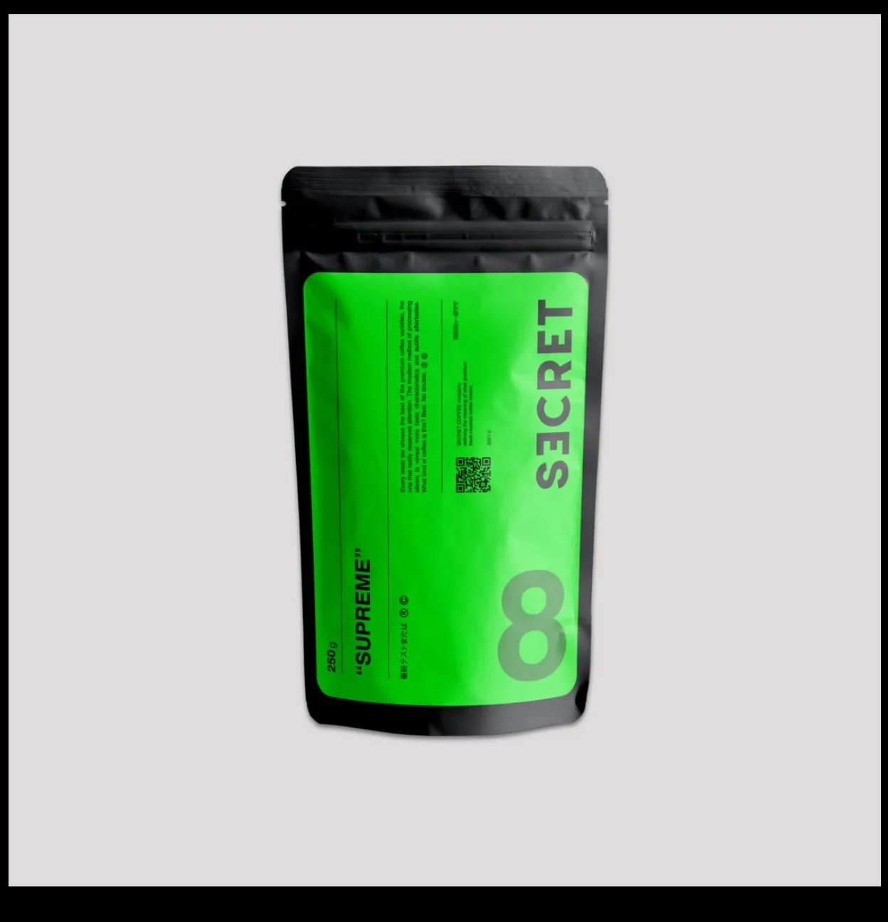
A coffee bag has to fit the name, roast, variety, origin, roast date, weight, brew method and ingredients. A logo drawn for a storefront sign either gets lost at that size or eats the space the information needs. If the system was never tested on a real 250 g label, you'll be redoing it after the very first print run.
Several weights, several coffees
250 g, 1 kg, drip bags, samplers. Plus five to ten products that have to be told apart on the shelf in half a second. That's no longer a logo — it's a coding system: color, index, composition. Either someone thought it through, or the shelf is a mess.
Cups aren't printed like brochures
One or two colors, flexo printing, a stretchy surface, distortion when the cup is formed. A mark with hairlines and a gradient simply won't print — and you'll hear that from the printer, not from the studio.
The sign works at night
Backlighting, illumination, height limits in historic city centers. The sign version of the mark is a decision of its own, not the main logo scaled up.
A product card is a different format
A 400-pixel square with nine identical ones around it. What wins here isn't beauty but how easy you are to tell apart in the grid. Most café identities have never passed this test, because nobody ever put them in a grid.
Instagram eats the system
A café posts every day, and it's a barista with a phone doing it, not a designer. If the brand book has no simple templates and no rule for “what to do when there's no photo”, three months later the feed looks like five different places.
Delivery
The cup sticker, the tape, the box, the insert. It's the part of the brand customers see at home, and it's usually the part nobody ever wrote down.
How not to look like everyone else
Over the past ten years specialty coffee has built its own visual canon: minimalist grotesque type, kraft paper, terracotta and olive, lots of white space, top-down shots of beans. It works — and that's exactly why it doesn't.
When eight bags in the same style sit on a shelf, the buyer chooses a price, not a brand. An identity made “the way it's done” turns you into a nameless commodity and takes away the one lever that lets you charge more.
What we do about it in practice. We don't break the category for the sake of originality — that's the other extreme, and it puts people off. We look for one parameter where the brand is physically different and build the system around it:
Range coding
If competitors tell their coffees apart with small print and you do it with a color and an index visible from two meters away, you've won the shelf without any “creative”
Format
An unusual bag proportion or a differently shaped valve sticks in memory better than any logo
Voice
Most coffee brands say the same thing — “we love coffee”. A tone built on specifics instead of poetry is recognizable instantly
One physical detail
The color of the tape, the shape of the sticker, the way the bag folds. Something customers see at home and remember with their hands
For Secret Coffee, that parameter was freshness and transparency about the roast date — it shaped both the layout of the bag and how the product card works.
Rule of thumb: if your logo could go on a competitor's bag and nobody would notice the swap, the system isn't done.
Case study: Secret Coffee
A premium coffee roaster and online store in Ivano-Frankivsk, Ukraine. We designed the identity, the packaging and the digital side — and the brand still runs without a redesign.
Positioning
PREMIUM / FRESHROASTED — a short formula that works as the website headline, a line on the bag and the profile bio at the same time
A system for the range
espresso roast, drip, blends — every category is recognizable on the shelf and in the store grid
Packaging
for different weights, with room for the required information on variety, roast and date
Online store
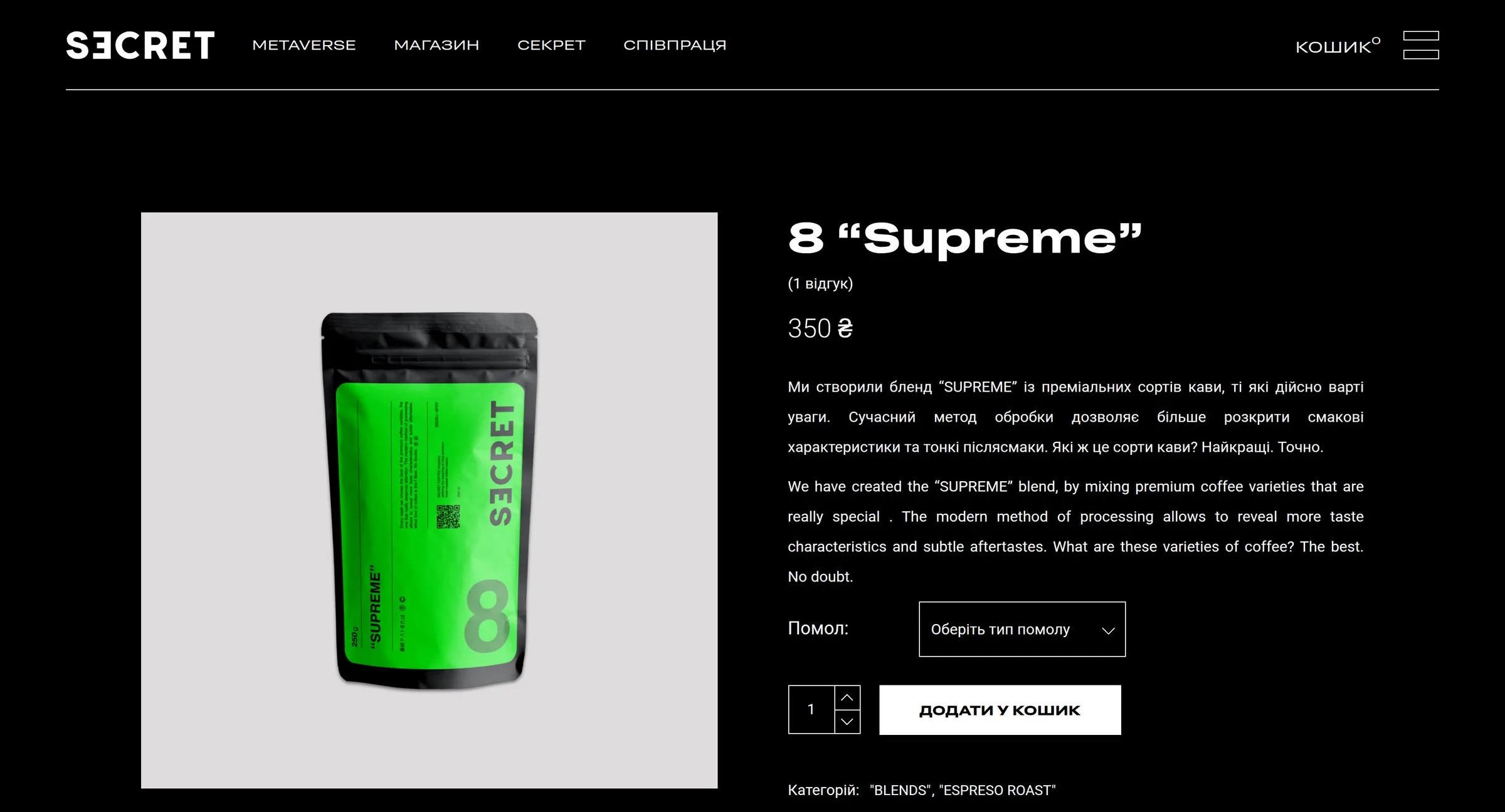
with a catalog and cart: the identity was tested where most coffee brands never test it — on a product card next to nine others
Digital channels
Telegram, Instagram — templates that someone without design training can post from
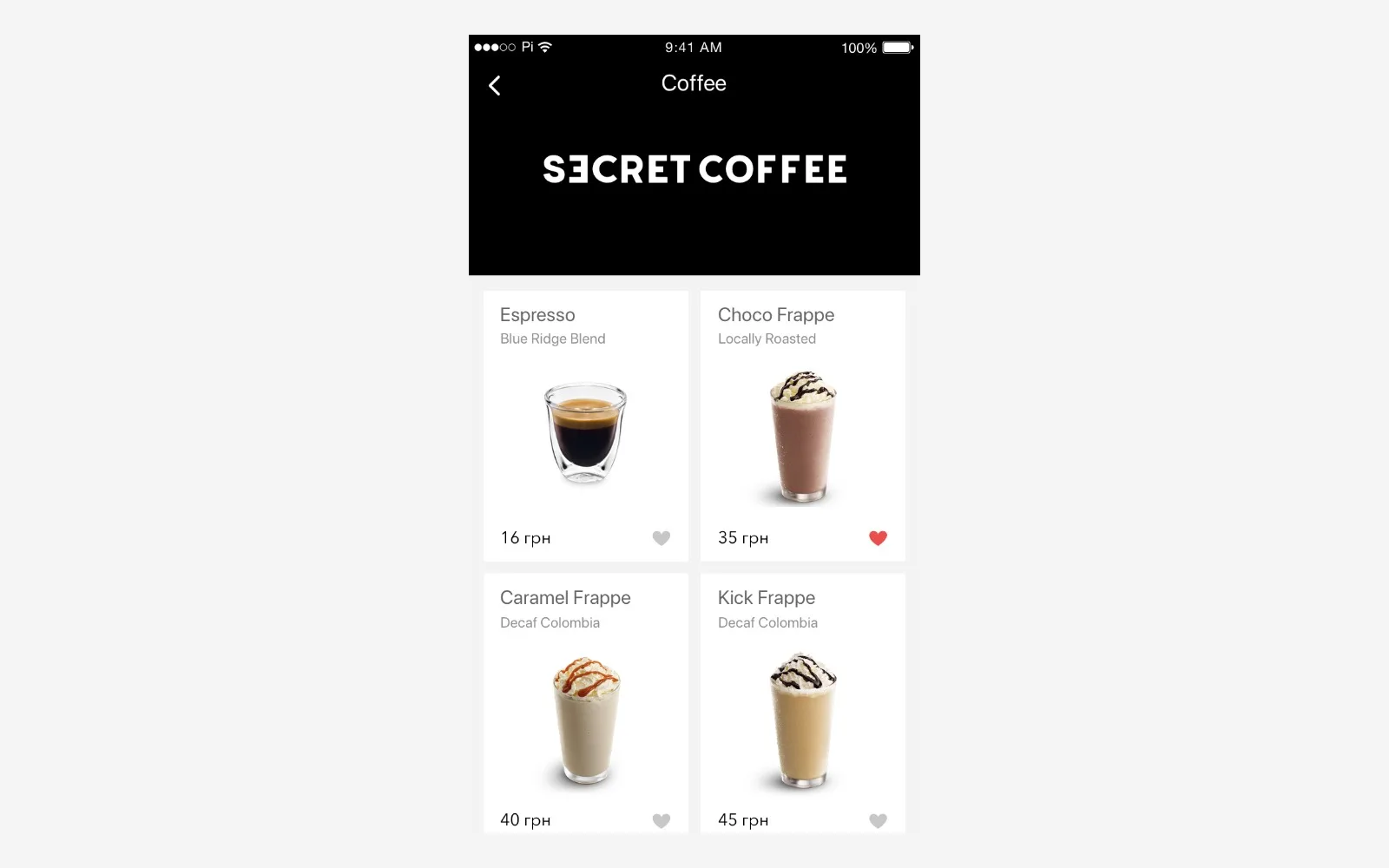
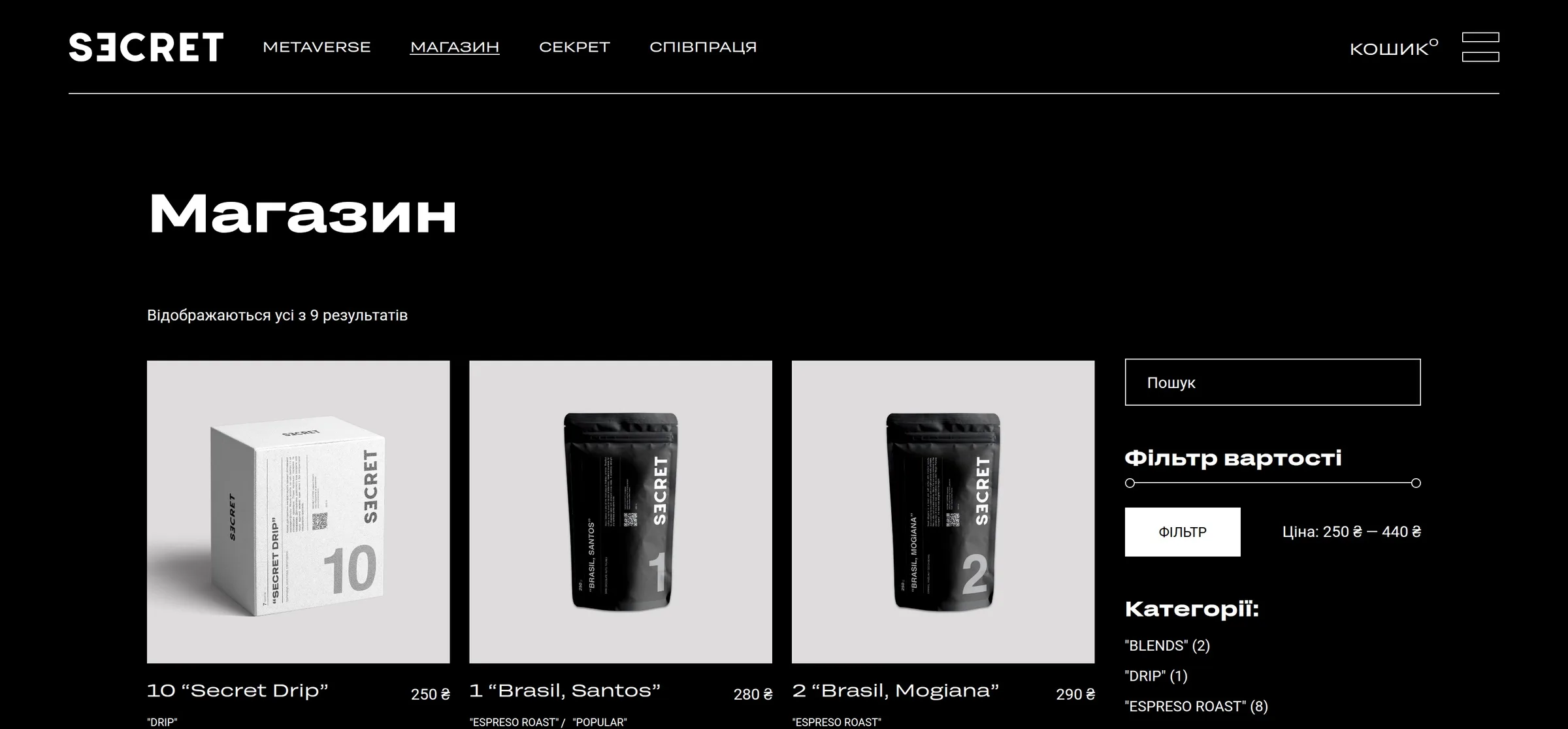
Why this case matters. Not because it looks good. Because it's the most honest test there is: the brand survived a growing range, new sales channels and daily use by people who didn't design it.
What's included
The scope depends on whether you're a coffee shop, a roaster or both. The core set:
Identity
The mark and its versions: primary, compact for cups, for the sign, monochrome. A palette with defined roles. A type pairing that covers every language you sell in. A pattern.
Packaging
Layouts for the weights you actually sell. A template a new product drops into without a designer. Print-ready files with bleeds and the right color profile.
In-store
Menus, price tags, cups, stickers, staff uniforms, table tents, coasters.
Signage
A layout designed for both illumination and daylight.
Delivery
Sticker, tape, box, thank-you insert.
Digital
Social media templates, avatars, covers, product cards, store banners.
Brand book
The document that captures all of it — so a new contractor a year from now doesn't reinvent everything.
If you need an online store too
This is where we differ most from branding studios: we build it ourselves.
Coffee is one of the few products where online sales work from day one: customers try it in the café and want it at home. But between “we have an identity” and “we have a store” there's usually a separate contractor, a separate budget and three months of back-and-forth, after which the store looks like someone else's website with your logo on it.
We do both as one team: catalog, product cards, cart, payments, shipping — on the same system as the identity. That's how it went with Secret Coffee.
from $18,000 for the brand and the store together — less than branding and development separately, because you don't pay twice for the same decisions.
Formats and pricing
| Format | What's included | Timeline | Price |
|---|---|---|---|
| Logo book | mark, colors, fonts, 2–3 applications | 2 weeks | from $2,000 |
| Coffee shop brand | identity, in-store items, signage, social media, brand book | 3–4 weeks | from $4,500 |
| Brand + packaging range | all of the above + a packaging system for every product | 4–5 weeks | from $6,000 |
| Brand + online store | all of the above + a turnkey online store | 6–8 weeks | from $18,000 |
Payment 50 / 50. Rights transfer to you once paid in full.
What a launch budget is made of
Design is a third to a half of what you spend on the visual side. The rest usually isn't budgeted for, and at opening it turns into an unpleasant surprise. A rough breakdown for a new location:
| Item | Ballpark | Who does it |
|---|---|---|
| Identity and applications | $2,000 – 6,000 | us |
| Online store, if needed | from $15,000 on its own; with the brand — from $18,000 for everything | us |
| Sign: fabrication and installation | depends on size and lighting | sign maker |
| Packaging print, first run | depends on volume — from a thousand units it gets cheaper | printer |
| Printed cups | minimum order is usually a few thousand | manufacturer |
| Staff uniforms | per person | garment maker |
| Product photography | separate; a must for the store | photographer |
What we take on: identity, layouts, prepress, the store and the brief for the photographer. What we don't: printing, sign fabrication, photo shoots. Not because we can't coordinate them, but because a middleman on these items raises your price by 15–30% and adds nothing — you're better off dealing with the printer directly.
We name these figures before we start, not after, so you can plan the whole budget.
How we work
Business review — 2–3 days
Format, average ticket, who comes in, what sells, whether a second location or online sales are planned. This decides the set of applications: a café next to an office park and a roaster shipping nationwide have less in common than it seems.
Concepts — 1–1.5 weeks
Three directions for the mark, shown straight away on real applications: bag, cup, sign. Not on a white background — a mark on white tells you nothing.
System — 1–1.5 weeks
Palette, typography, pattern, range coding, templates.
Applications and prepress — 1 week
Files in a format the printer accepts without questions.
Brand book and handover
The document, source files, licensed fonts, social media templates.
If the store is in scope, it runs in parallel from stage three.
What order to launch in
The most common mistake is ordering the sign first because the rent is already running. Then the sign has to be redone, and that's the most expensive redo of all.
1. Name
before anything else. Checking the domain and social handles takes a day, while changing the name after a print run costs as much as the print run itself
2. Mark and core system
1.5–2 weeks. Tested on the bag, the cup and the sign from the start
3. Sign into production
as soon as the mark is approved. Sign makers have queues, and it's the longest lead time on the list
4. Packaging and cups
in parallel with the sign, allowing for minimum print runs
5. Social media
can go live a month before opening — the cheapest way to gather your first customers
6. Store
after opening, once there are photos of the real product and it's clear what sells
Overall timeline from decision to opening: 2–3 months, of which design takes 3–4 weeks. The rest is production and queues — which is exactly why you start with the name, not the sign.
Who this isn't for
- A single location with a budget of a few hundred dollars. That's a perfectly normal job, but a freelancer will get it done faster. Our projects start from $2,000
- You only need a sign, and fast. A sign without a system is a cost you'll end up paying twice
- “Make it like [chain], just a different color.” We don't take these on: in a niche where everyone already looks alike, a copy gives you no edge
Frequently asked questions
From $2,000 for a logo book to $18,000+ for a brand together with an online store. Prices are the same in every market. The exact figure depends on the number of applications and on whether you need a packaging system for your range.
If you order layouts from different contractors — yes, it pays for itself by the second project. If one person in-house does everything, start with a logo book: it can always be grown into a full brand book without starting over.
3–4 weeks for a coffee shop brand, 6–8 weeks together with an online store.
Yes, ready to hand over to the printer: bleeds, color profiles, separate versions for flexo printing on cups. We don't order the printing ourselves — it's a separate service, and you're better off dealing with the printer directly.
Yes, that's the most common path. What matters is that the bag and the cup are tested at the logo stage — otherwise “expand” turns into “redraw”.
We build a system where a new product is added from a template: color, index and composition are already defined. You don't need a designer for every new coffee.
No, but we write the brief for the photographer: which shots, what lighting, which formats. That removes the most common problem — photos that look great but don't fit the product card.
Yes. Secret Coffee is based in Ivano-Frankivsk, and we're in Kyiv. All the work happens remotely, except for the print stage, where it helps to be close to the printer.