
Brand book design
A system you can build a product from, not a PDF that ends up in an archive.
Identity, applications and rules for a digital product: typography that covers the scripts you need, checked contrast, grid and interface states. Choose the scope that fits your business.
Choose a format
Compare →Logo book
Logo, colors, fonts, basic rules. 10–15 pages. Fits when the brand has just appeared and needs a baseline to keep things consistent.
Brand book
Full identity: system, applications, graphics, tone of voice, 25–35 pages. The standard choice for a business entering the market or refreshing its image.
Brand book with design system
Everything above plus digital components, states, design tokens and developer documentation. Chosen when a website or app follows right after the brand book — which is almost always.
The short version, for anyone comparing quotes. A brand book offered for a few hundred dollars is, as a rule, 10–15 pages of logo rules. We do something else: a system that can actually be built, with design tokens and developer documentation. If what you need is logo rules, fast and cheap, we're not the best choice — and we say so up front.
What goes into a brand book
Not a list of pages, but a list of decisions someone has to make. If the studio doesn't make them, a developer will — at random, the night before release.
Logo and mark
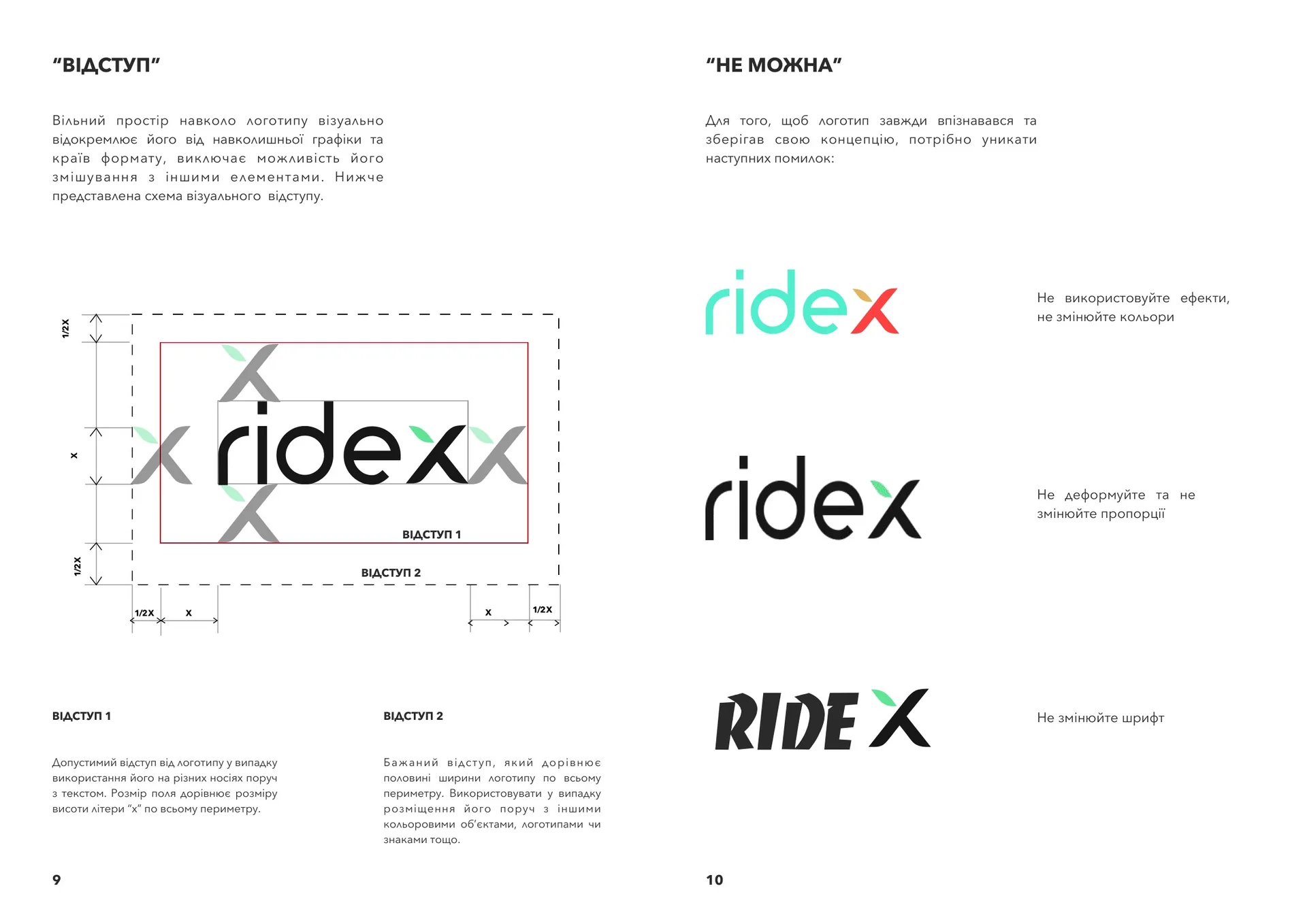
Primary, horizontal, compact and monochrome versions. Minimum sizes for print and for screen, separately. Clear space. What's not allowed — shown with examples, not described in the abstract.
Color
Not "a six-color palette" but the role of each color: primary, accent, surfaces, text, error and success states. In HEX, RGB, CMYK and Pantone for print. Contrast pairs checked against WCAG — otherwise you find out during the build that the brand grey on white is unreadable.
Typography
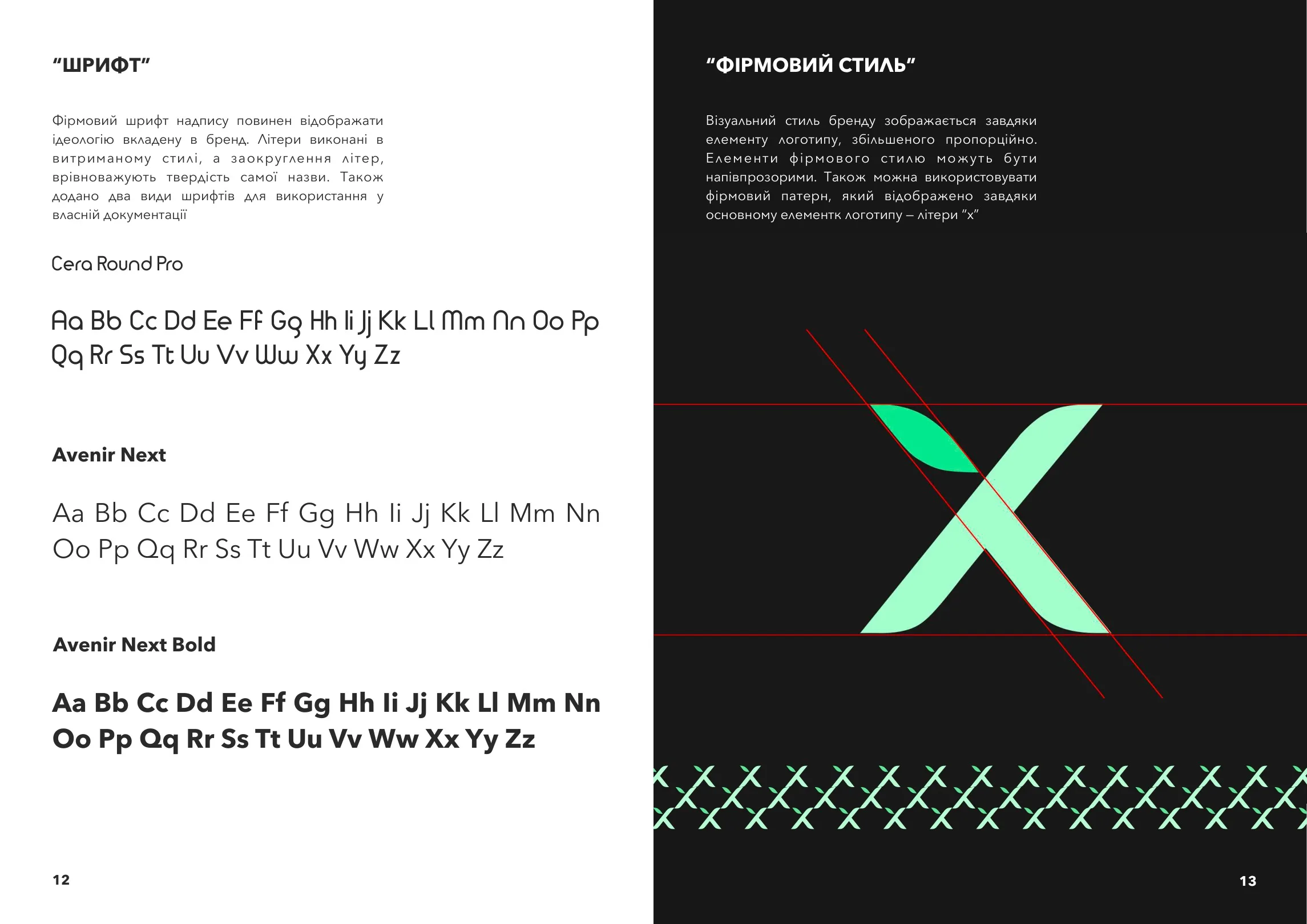
A type pairing, a size scale, line spacing, behavior on small screens. And support for every script you'll publish in — Cyrillic, for example. Half of today's fashionable grotesques don't have it, and that tends to come out once the layouts are already approved.
Grid and spacing
A modular grid, a spacing step, layout rules. This is what turns a set of elements into a system that someone else can carry on.
Graphics and patterns
Brand elements, icons, illustration approach, photography rules.
Applications
From business cards to vehicle branding — depending on the business. For Soloway we designed 17 items, from a notebook and a mug to a yoga mat and stickers.
Digital components
Buttons, inputs, cards, states — in a form a developer can build from. This is what classic brand books lack, and why they don't survive production.
Design tokens
Colors, sizes and fonts exported in a format a developer plugs in with one line: CSS variables, a Tailwind config, Figma variables. This is the bridge between the PDF and the code.
Tone of voice
How the brand speaks: do's and don'ts on real phrases, not abstract adjectives.
What it looks like in practice
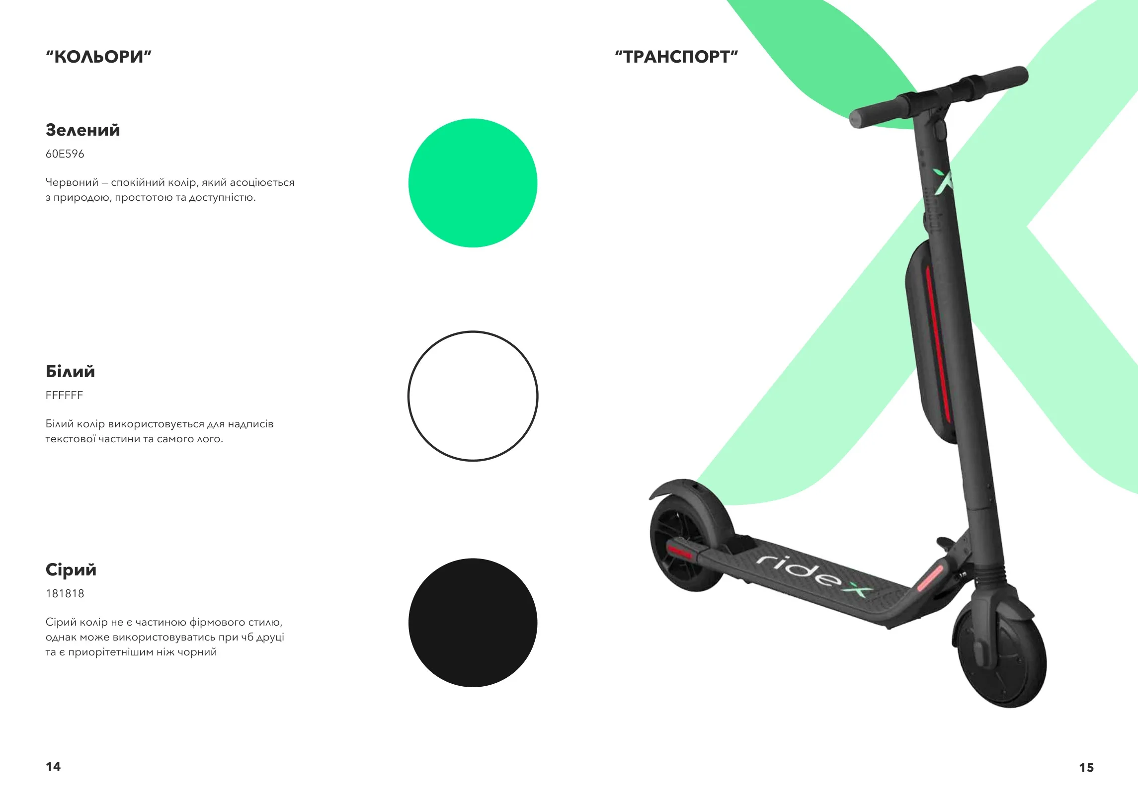
Ridex — a 21-page brand book and the app built from it
An e-scooter sharing service in Ivano-Frankivsk, a city that had never had anything like it. So the brand book had to explain not only what the brand looks like, but what the user should do: walk up, unlock with your phone, ride.
We did the naming, the mark, the system, the brand book — and the app built from that brand book. Then the identity moved onto the scooters themselves: liveries, numbers, wayfinding elements around the city.
What it proves: a brand book is tested not in a presentation, but when you have to build a screen from it and wrap a vehicle in film.
See the Ridex case →
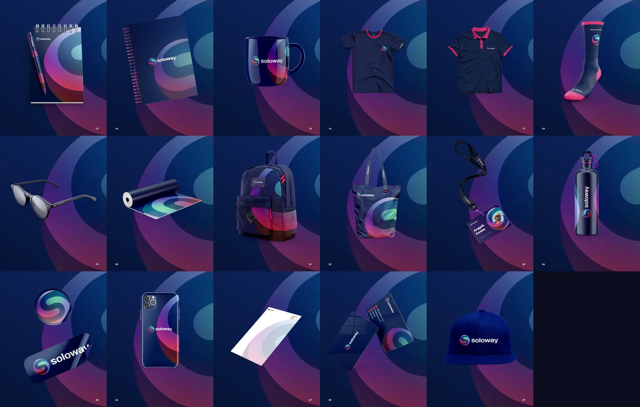
Soloway — 30 pages and 17 applications
A corporate brand where the challenge wasn't the mark but the scale: the system had to work equally well on documents, merch and digital media. Thirty pages of rules and seventeen produced items.
See the Soloway case →Secret Coffee — a brand that still works
Identity, a subscription app and an online store. The most valuable thing here isn't the visuals, it's the fact that the brand is alive and still in use, with no redesign. That's the most honest test of a system: not how it looks in the pitch, but whether it holds up to everyday use.
See the Secret Coffee case →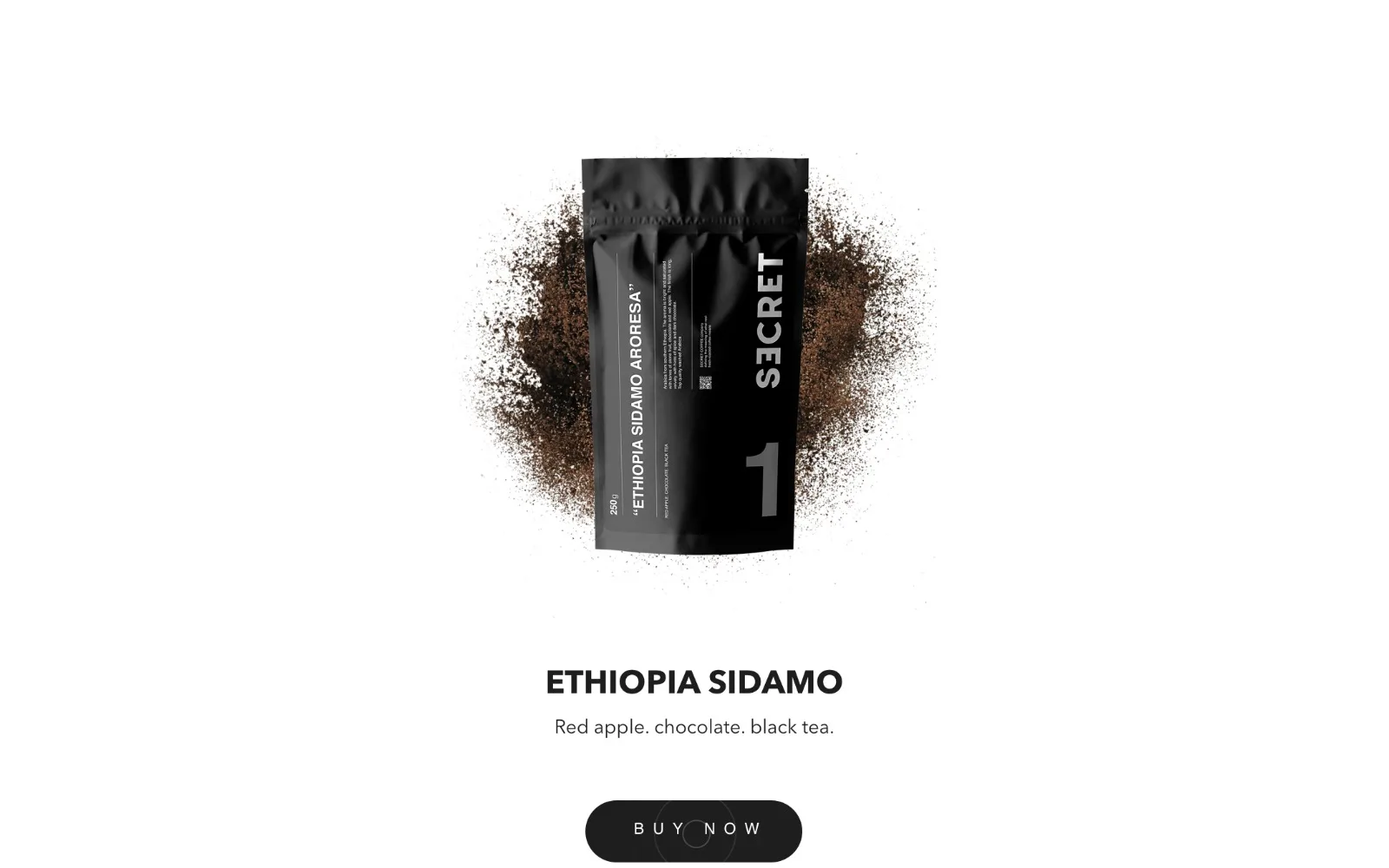
Seven mistakes that stop a brand book from working
We've made around a dozen brand books and inherited about as many from other studios when we were brought in to build the product. This is the list of what breaks most often.
A typeface without the scripts you need
The most common mistake, and the most expensive. The typeface is chosen for how it looks on an English-language mockup, the brand book is approved — and then it turns out the font doesn't cover the language you actually need: no Cyrillic for Ukrainian or other markets, for example. From there you have two options: change the font and rework the whole system, or drop in a random substitute and watch the brand lose recognition in that market. Check this before the first concept, not after.
Colors without roles
A palette of six swatches says nothing about which color signals a form error, which one is the card background and which is the text on that background. The developer decides — and decides differently on every new screen. A year later the product has twenty shades instead of six.
Contrast nobody checked
A light brand grey on white looks stylish in a presentation and unreadable on a phone in the sun. If the brand book doesn't lock in tested pairs, accessibility has to be rescued during the build — and by then half the brand colors are gone.
No minimum logo size for screens
The rules are usually written for print: "no smaller than 20 mm". What that means in pixels on a 44×44 avatar isn't stated anywhere. The result: the mark turns into a smudge in the mobile header.
No states
The button is drawn in one state. What happens to it on hover, press, disabled, loading — not described. That's four decisions per element that someone else will make for you.
The brand book as a picture, not as data
A PDF from which a developer retypes color codes by hand. Every retyping is a chance to make a mistake, and the mistakes turn up six months later. Design tokens solve this completely: one value, one source.
No rules for what doesn't exist yet
A good brand book describes not only the existing applications, but the principle for making the next ones. Otherwise the very first new task — from packaging to a banner — starts from scratch.
Our brand books since 2021 cover all seven points. Not because we're smarter, but because we've built products from our own documents and stepped on each of these mistakes once.
Types of brand books
Not everyone needs the full package. Three formats that actually make sense:
Logo book
Logo, colors, fonts, basic rules. 10–15 pages. Fits when the brand has just appeared and needs a baseline to keep things consistent.
Brand book
Full identity: system, applications, graphics, tone of voice, 25–35 pages. The standard choice for a business entering the market or refreshing its image.
Brand book with design system
Everything above plus digital components, states, design tokens and developer documentation. Chosen when a website or app follows right after the brand book — which is almost always.
If a product is planned after the brand book, the third option costs less than "brand book now + adapting it for development later". You don't end up paying twice for the same decisions.
What affects the price: the number of applications, whether you need naming, the number of languages, the depth of market research, urgency.
Which to choose: comparison
| — | Logo book | Brand book | Brand book + design system |
|---|---|---|---|
| Logo and versions | ✓ | ✓ | ✓ |
| Colors with roles | basic | ✓ | ✓ |
| Type scale | — | ✓ | ✓ |
| Grid and spacing | — | ✓ | ✓ |
| Applications | 2–3 | 8–15 | 8–15 |
| Tone of voice | — | ✓ | ✓ |
| Digital components and states | — | — | ✓ |
| Design tokens for development | — | — | ✓ |
| Ready to build a product from | no | partly | yes |
| Timeline | 2–3 weeks | 4–6 weeks | 5–7 weeks |
The most common scenario: people take the middle option, start a website three months later — and have to come back for the third. If a product is in your plans, it's cheaper to take the third one right away.
How we work
Research — 3–5 days
The niche, 3–5 competitors, the audience. The output is a short memo, not a hundred-slide deck. We show it to you before we start drawing, so that disagreements surface at this stage and not at the fourth.
Brand platform — 3–4 days
Positioning, values, tone of voice. Two or three pages for you to approve. Everything designed after this rests on that document.
Identity — 1.5–2 weeks
Three concepts for the mark, one chosen, then refined. We don't show thirty options: three well-developed ones are stronger than thirty shallow ones.
System and applications — 1–1.5 weeks
Palette, typography, grid, patterns, a set of applications for your specific business.
Brand book and handover — 3–5 days
The document, source files, design tokens, font licenses. Plus an hour-long session with the people who'll be using it from then on.
4–6 weeks in total. Two rounds of revisions at every stage are included in the price.
Price
Out in the open, because hidden prices waste both sides' time.
| Format | Range | Timeline |
|---|---|---|
| Logo book | $2,000 – 3,500 | 2–3 weeks |
| Brand book | $4,500 – 8,000 | 4–6 weeks |
| Brand book + design system | $8,000 – 12,500 | 5–7 weeks |
| Naming on its own | $1,000 – 2,000 | 1–2 weeks |
Payment is 50 / 50: half at the start, half before handover. Rights transfer to you once paid in full.
How we calculate the cost
Not plucked out of thin air, and not by page count. Three multipliers:
Scope of the system
How many applications, whether you need digital components, how many languages. A bilingual brand isn't "the same plus a translation" — it means testing every decision against two alphabets.
Depth of research
A new market needs analysis; refreshing an existing brand often only needs an audit of what's already there.
Urgency
Halving the timeline costs more not because we're taking advantage, but because parallel work needs more people and more sign-offs.
Exactly what you get in the files
The list matters: "brand book" means a different package at every studio, and you can't compare quotes without it.
- Brand book PDF — the main document, suited both to on-screen viewing and to print
- Vector logo — SVG, AI, EPS: every version, including monochrome and compact
- Raster versions — transparent PNGs in three sizes, a favicon and an app icon set
- Fonts — files and licenses, separately for web and print. If the typeface is paid, we tell you the cost before approval, not after
- Design tokens — JSON, CSS variables, Tailwind config, Figma variables
- Application layouts — print-ready, with bleeds and the correct color profile
- Figma file — with components, not flat pictures
- Patterns and graphics — source files, not exports
All of it is handed over as a single archive plus access to Figma. Rights transfer to you once paid in full, with no restrictions on use.
Who this service isn't for
- You need a logo in a week for $300. That's a perfectly normal job, just not ours — a freelancer will do it faster and cheaper
- You already have a brand you like and only need a website. Then this isn't the page for you — you need website development
- Decisions are made by a committee of eight with no one holding the casting vote. We work with one client who can say "yes"
- You want "like the competitor, just a different color". We don't take that on — it isn't saving money, it's postponing a redo
What makes us different
We write code from our own brand books
That's not a slogan: our portfolio has projects where we did both the brand and the product — Ridex, Secret Coffee. So our documents contain no decisions that can't be built.
No design-to-development handoff
It's the most expensive stage of most projects: re-reading mockups, questions with no one to answer them, states that don't exist in Figma. With us, the chain ends inside the team.
Design tokens included
The developer gets variables that plug in with one line, not pictures.
We stay after delivery
A brand book isn't the end of the work, it's the start of using it. Questions come up in month three, and we answer them.
Frequently asked questions
A logo book describes the logo: versions, sizes, clear space, misuse. A brand book describes the system: colors with roles, typography, grid, applications, tone of voice. If the brand has to live across ten applications and an interface, a logo book won't be enough.
Our ranges: logo book from $2,000, brand book from $4,500, brand book with design system from $8,000. Prices are the same for every market. There are offers out there for a few hundred dollars — for that money you usually get 10–15 pages of logo rules, with no system and nothing you can build from. That's not bad, it's a different service.
4–6 weeks for a full brand book. Faster is possible, but at the expense of the research stage — and then the risk of rework goes up.
A PDF document, all source files in vector, fonts with licenses, design tokens for development and print-ready application layouts.
You can, but we recommend at least a logo book. Within six months, a logo without usage rules turns into five different logos in the hands of five contractors.
It's one of the most common problems, and it has to be solved when the typeface is chosen, not after the layouts are approved. We either pick a typeface that covers every script you need from the start — Cyrillic, for example — or find a companion font matched in weight and character, and lock that in as a rule in the brand book.
If you hire contractors for design — yes, it pays for itself by the second project: you stop explaining the same things to every new contractor. If all design is done by one person in-house, you can start with a logo book.
Yes. Most of our projects run remotely, with in-person meetings in Kyiv when needed.