Ridex
Brand and app for an e-scooter sharing service in Ivano-Frankivsk, Ukraine.
Context
In 2019, e-scooter sharing was already reshaping how people got around in Kyiv and a wave of Western European cities — but Ivano-Frankivsk, a regional center in western Ukraine, had never had a shared-mobility service of any kind. There was no local competitor to borrow conventions from, no existing vocabulary for "unlock," "active ride" or "drop zone" in the local market. Whoever launched first would also be writing the rulebook for how the category behaved there. That put unusual weight on the brand: it wasn't just representing a company, it was introducing and defining a new kind of transport for a city that, until then, had only known walking, marshrutkas and personal cars.
The problem
Ridex needed more than a logo — it needed to make an unfamiliar format legible on sight. Someone walking past a parked scooter had to understand, without an ad or an explainer, that this was: available to rent, unlocked by phone, and could be left somewhere other than where it was picked up. Get that wrong and the service reads as clutter left on a sidewalk, not as transport.
The brand also had to work as physical infrastructure. Unlike a delivery app, an e-scooter brand lives outdoors, unsupervised, in public space — on the vehicle itself, on parking-zone signage, on whatever packaging the hardware ships in. It had to be legible on the street, hold up through Ukrainian winters and summers, and look good enough that people wanted to be seen riding it, not embarrassed by it. And because the hardware and the app flow (map, unlock, active-ride timer, wallet) were being scoped from zero alongside the identity, brand and product decisions had to move together — not brand-first-then-handoff, or the identity would end up describing an app that didn't exist yet.
Constraints
Ridex wasn't a multi-city rollout with a marketing budget to match — it was a single-market launch, and the brand book had to earn its keep across an unusually wide set of physical touchpoints for one identity: vehicle livery, street signage, packaging, advertising and digital collateral, business cards and the app itself, laid out across 21 pages of rules. Specific budget and timeline figures for the 2019 engagement aren't part of the record we kept, so we won't put numbers on them here. What is documented, throughout the guidelines themselves, is the constraint that shaped every other decision: the brand had to work as an entry-level, non-intimidating format in a market with zero prior exposure to shared mobility — not just a mark on a screen.
The solution
We named it by combining ride with the suffix x — ride is a direct call to action ("go ride"), and x was chosen deliberately: in naming, letters like X, Z, Q and V read as forward-looking and technical (Xbox is the reference the guidelines cite), which fit a category the market hadn't seen before.
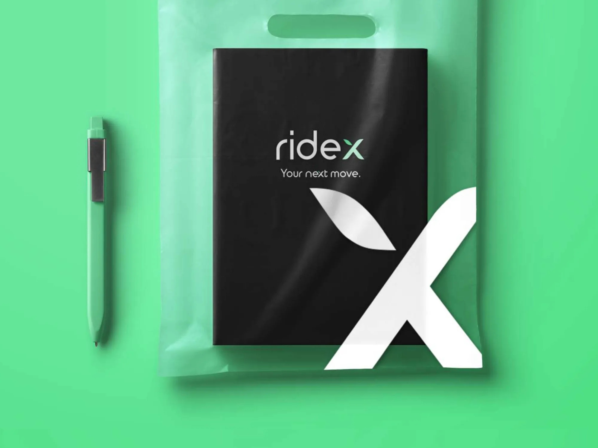
That reasoning shaped the logo too. The x is drawn as a leaf — a literal nod to sustainability, one of the three anchors the identity is built on alongside speed and innovation. The letterforms are rounded rather than geometric-hard, in a treatment the guidelines describe as Bauhaus-influenced, the same rounded logic used by brands like Beats and Pepsi. That was a deliberate choice against a colder, purely technical mark: the brand book is explicit that unfamiliar products risk alienating first-time users, and a shared-scooter service asking strangers to trust an unlock-by-phone flow for the first time needed to read as approachable before it read as advanced.
Color followed the same logic — green as the primary brand color, tied to nature, simplicity and accessibility rather than to speed or tech the way an electric blue or red would be. Typography split by audience: a rounded display face, Cera Round Pro, for the brand-facing wordmark, with Avenir Next and Avenir Next Bold carried through internal documentation for consistency.
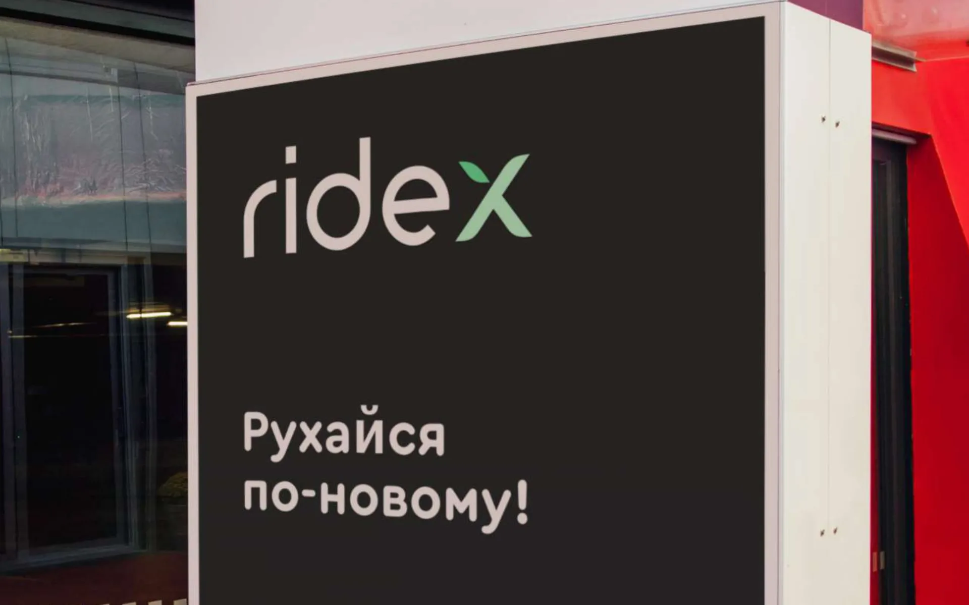
All of it was compiled into a 21-page brand book: logo construction, an inverted version for light backgrounds, clear-space and minimum-size rules, explicit misuse cases (no effects, no recoloring, no distorted proportions, no font substitution), the typeface system, a visual pattern built from the logo's own leaf shape, the color palette, and specs for every physical application — vehicle livery, street signage, packaging, advertising and digital collateral, and business cards.
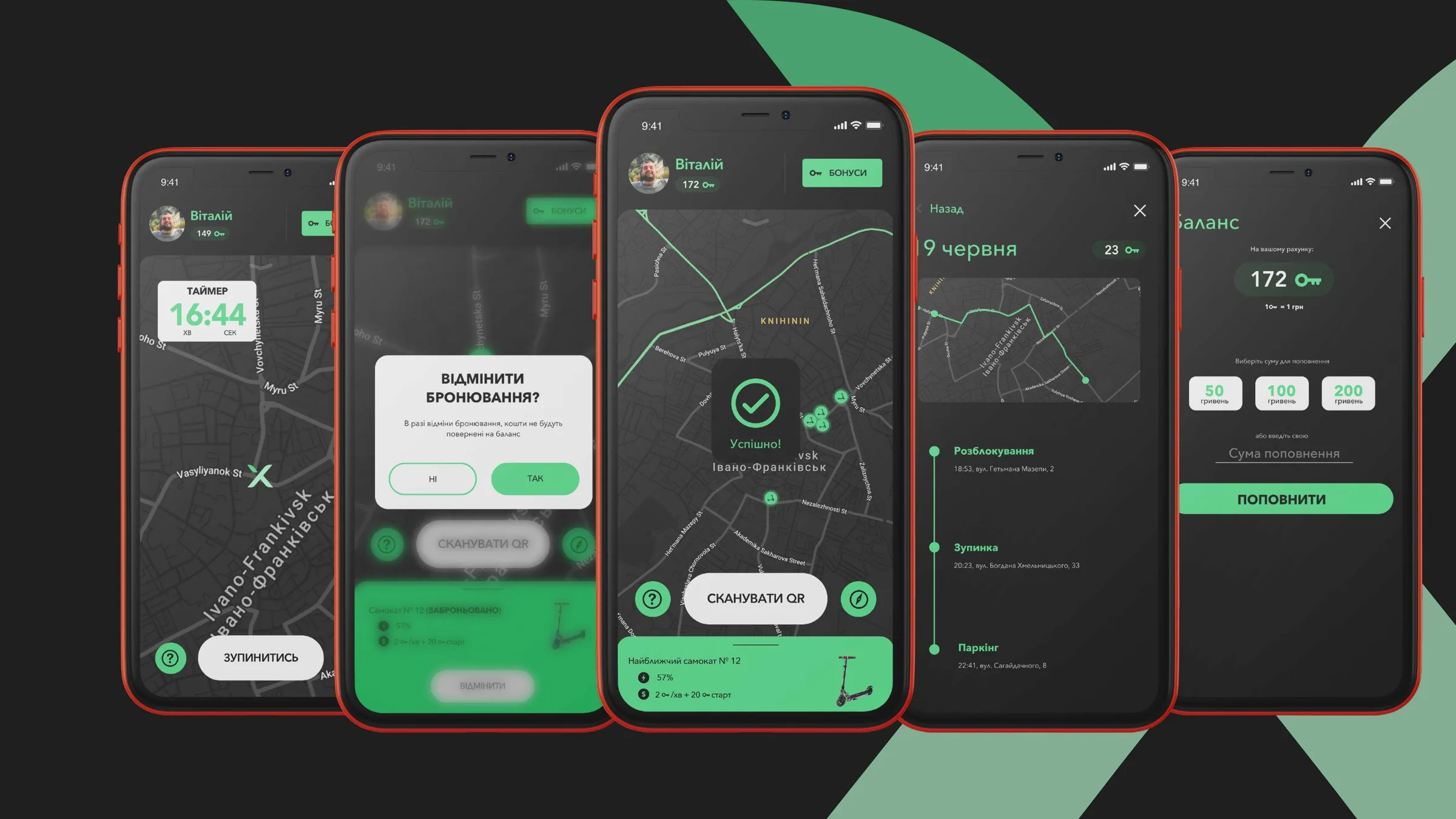
The app was scoped in parallel, not handed a finished brand to skin afterward: a map of nearby available scooters, QR-code unlock, a live timer during an active ride, booking, ride history and wallet top-up — the full loop from finding a scooter to paying for the ride, carried in the same rounded, approachable visual language as the physical brand.
What we rejected
We don't have a preserved shortlist of alternate names or logo directions for this project, and we're not going to reconstruct one we can't verify. What the brand guidelines do preserve is the reasoning behind the call that was made, and it reads as a deliberate rejection of the "harder" mobility-brand default: rounded letterforms over angular ones, a leaf worked into the letter x instead of a purely abstract mark, green instead of a colder, more clinical palette. The guidelines are explicit about why — new, unfamiliar products risk alienating first-time users, and in a city with zero prior exposure to shared mobility, looking too advanced was a bigger risk than looking too soft.
How it survived production
A brand that only works in a PDF isn't a system — it's a mood board. That's the standard we hold the deliverable to, and it's why the Ridex guidelines lean so heavily on misuse rules and per-medium specs (vehicle livery, wall signage, packaging, advertising collateral, business cards, digital) instead of stopping at a logo lockup: a mark that only has to survive one clean export from the studio isn't the same as one that has to survive being handed to a sign shop, a vehicle-wrap vendor and a packaging printer who've never spoken to each other.
On the product side, the app was designed through to real states — an active ride with a running timer, a wallet balance, a booking flow — not one idealized screen. What we can't confirm from here is operating scale: how many scooters actually went on the street, or for how many seasons. The client hasn't shared those numbers, and we're not going to invent them.
Outcome
What we can stand behind is the chain itself: a name, chosen and reasoned through; an identity system disciplined enough to survive vehicle wrap, signage, print and an app UI without falling apart; and a product designed end-to-end alongside it, not bolted on afterward. That's the case for one team owning brand and product together — not a claim about ridership numbers we don't have.
Scope